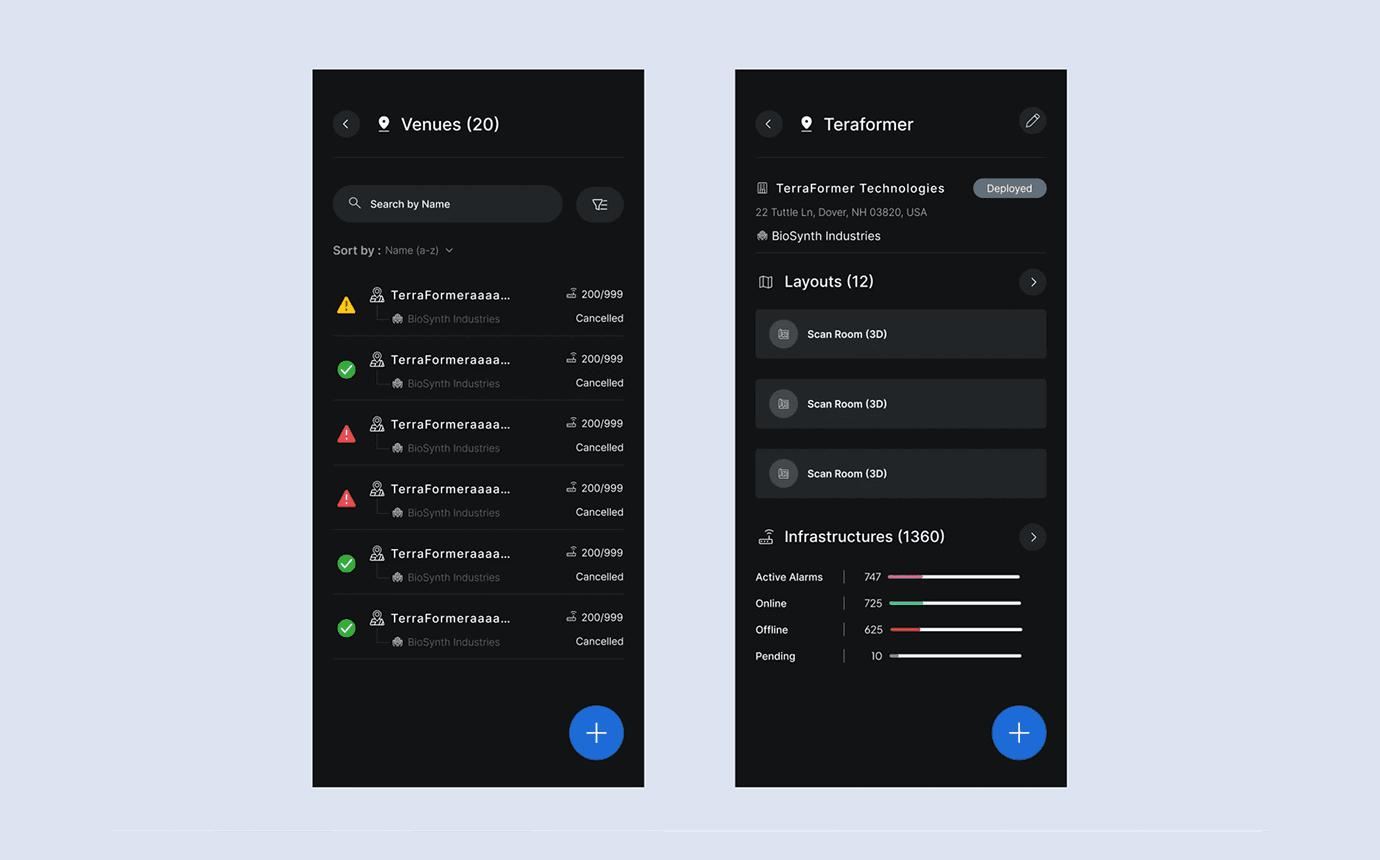
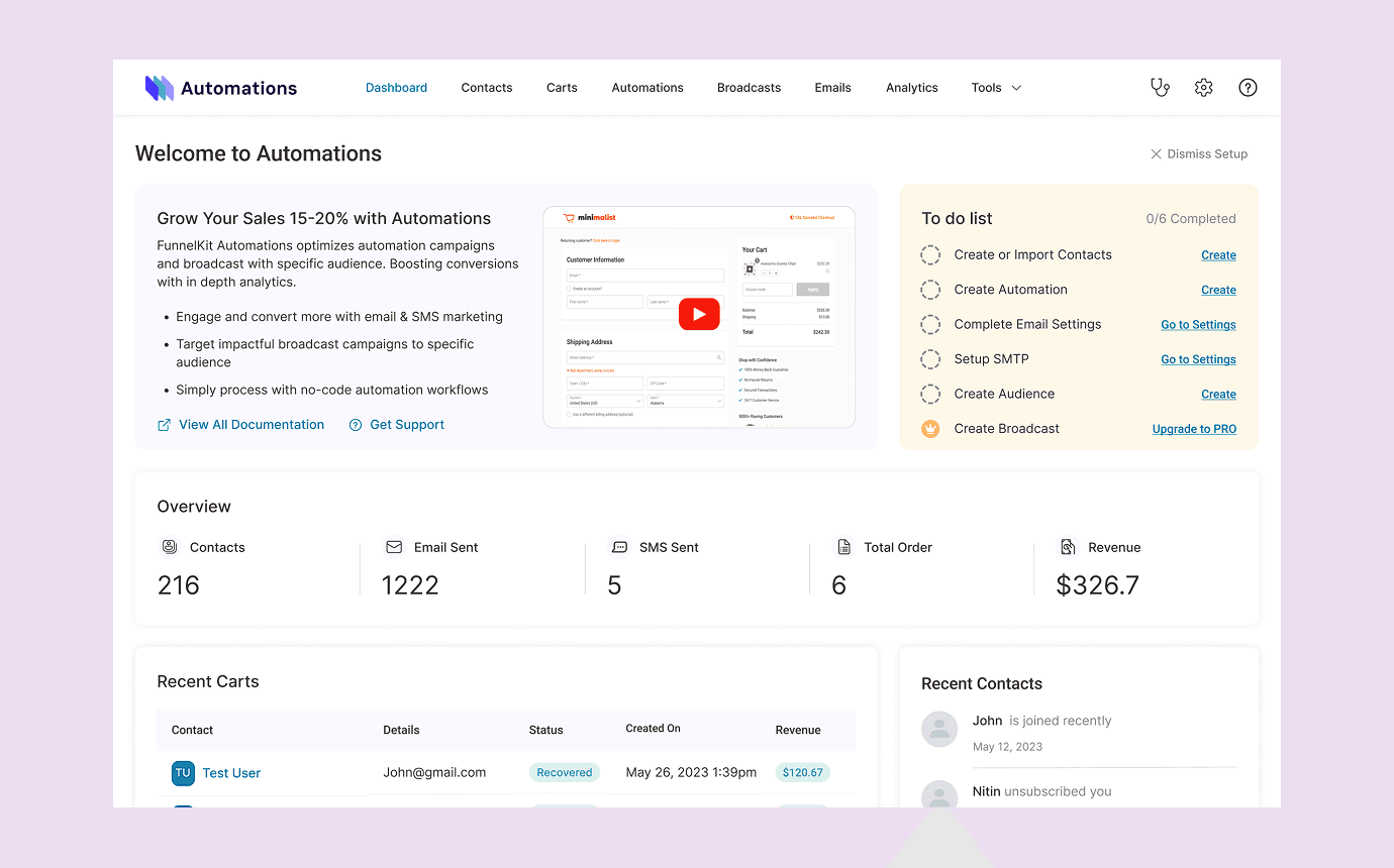
One governed mobile workspace for sales, rewards, network management and support across a distributed partner network.
Bring dealer and distributor activity into one useful mobile product without making a multi-module workflow feel overwhelming.
A governed platform only earns adoption when it helps partners complete their daily work as clearly as it helps the business see it.
“One governed workspace for a distributed partner network.
Partner App is a mobile product for dealers and distributors in the electrical industry. I worked on the experience at Truminds in 2024, helping move sales registration, rewards, network activity and support out of fragmented manual workflows.
Product UX Designer · Truminds · B2B mobile · 2024
The brief: bring the partner network into one system
Dealers and distributors were managing work through calls, spreadsheets and informal channels. The business had limited visibility into sales activity, rewards and network performance, while partners had to jump between disconnected processes to get their work done.
The brief was to create one governed mobile platform for the partner network: a place to register sales, track rewards, browse products, manage relationships and get support.
A guided start before the full workspace
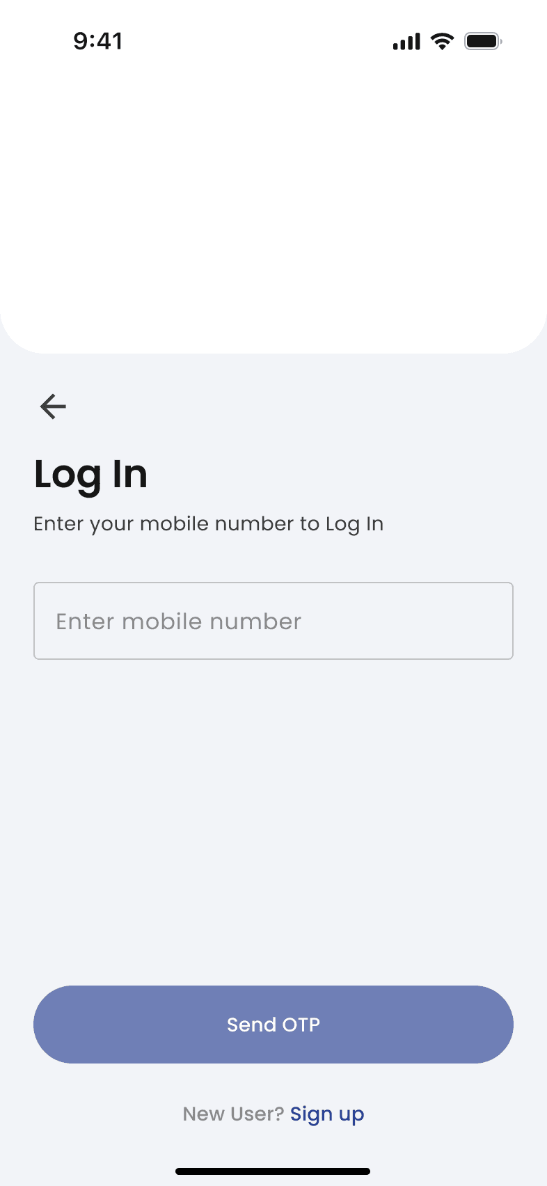
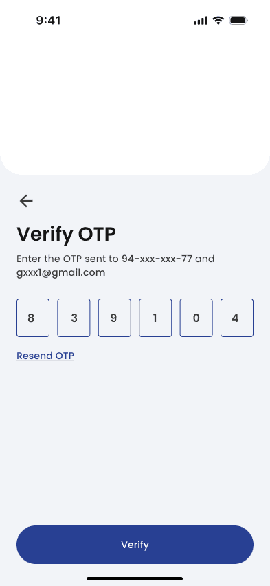
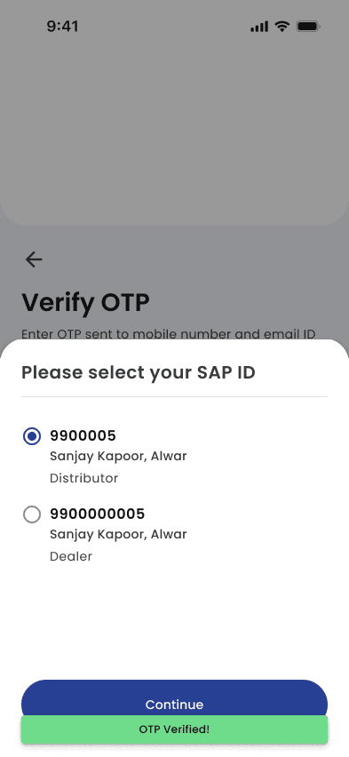
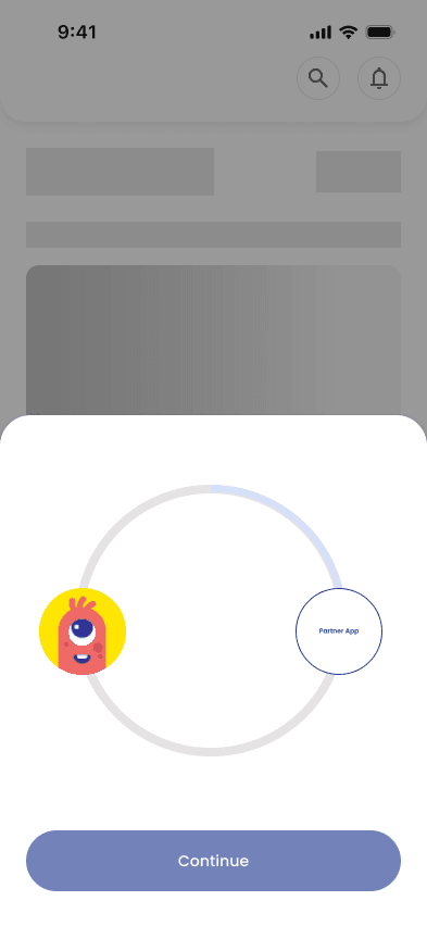
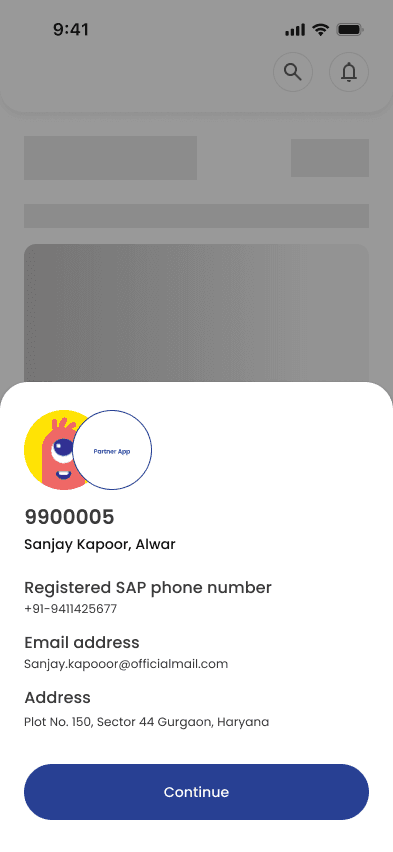
The initial flow introduced the product through a clear sign-in and verification sequence. It moved a partner from credentials to a verified account, confirmed their details and opened the iSmart rewards experience without exposing the entire app at once.
Designing a product with many jobs to do
The product needed to serve a broad set of partner tasks without turning into a dense portal. I worked across nine connected areas: secure access, sales registration, iSmart rewards, product discovery, network management, battery tracking, local advertising, reports and support.
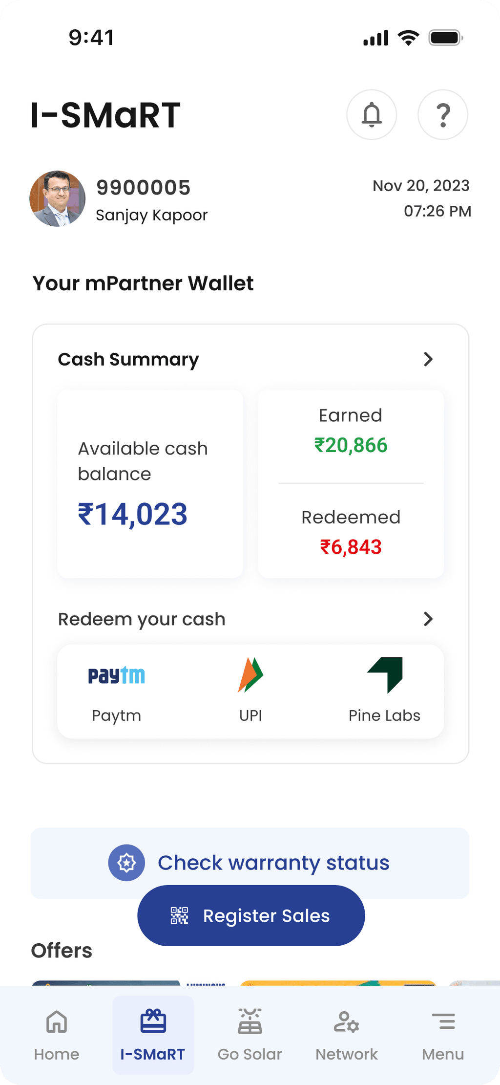
The navigation and dashboard prioritised the actions that affected daily work, while the rewards system gave partners a direct view of the value connected to their activity.
Key screens for a network that does not slow down
The high-fidelity work balanced information density with scanability across different partner roles and contexts.
How the work moved from brief to handover
I joined an engagement that was moving in parallel with development. My role covered requirements translation, product and interaction design, direction for a junior designer, stakeholder reviews, iterative sign-off and developer handover.
The work had to retain a consistent system while modules were designed and built in parallel. Clear states, documented edge cases and ongoing developer conversations kept the product coherent as new requirements surfaced.
What the first release delivered
- A controlled sign-in path for existing dealers and distributors
- Digital sales registration and reporting to replace manual tracking
- Network visibility for distributor and dealer activity
- A rewards system that tied partner incentives to measurable activity
- Product, support and local-marketing tools in the same workspace
The initial product phase was designed, audited and handed over for iOS and Android implementation in 2024.
What I learned
- Design and development need one shared rhythm. Parallel delivery only works when decisions and edge cases are communicated continuously.
- Governance needs a usable interface. Better visibility has to feel like useful support for partners, not control imposed on them.
- Clear structure makes complex products approachable. The more roles and modules a product has, the more each screen must justify its place.