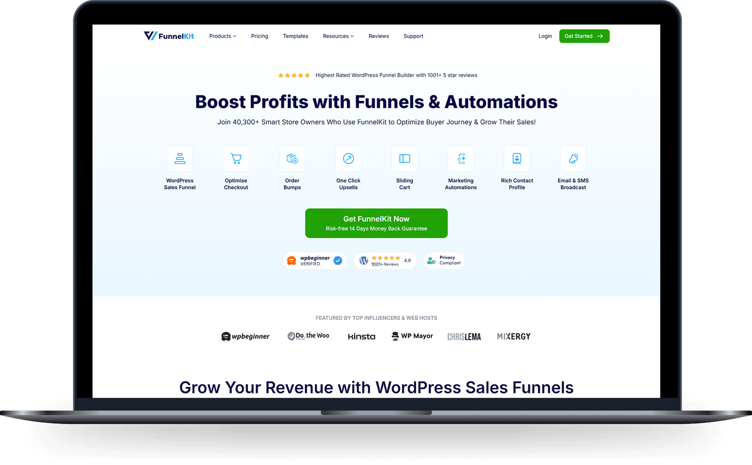
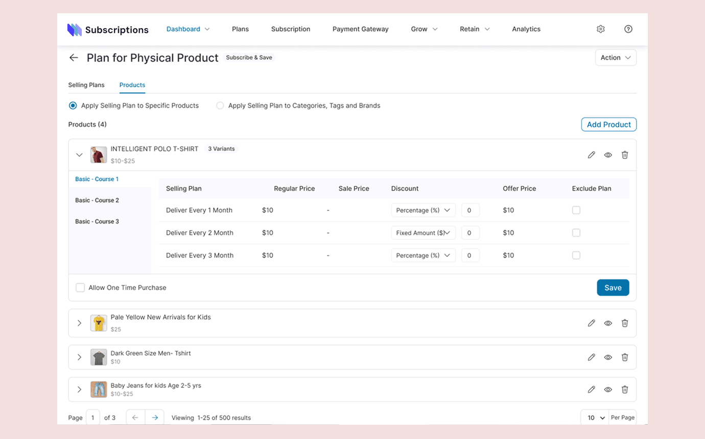
One place to build the whole sales journey, from the first sales page to checkout, post-purchase offers, tracking and launch.
Help merchants assemble pages, checkout, offers, rules and tracking without losing sight of the complete customer journey.
Start with the merchant's goal, then guide them through the same sequence they are trying to launch.
“One place to build the whole sales journey.
I worked with the FunnelKit team on the flows that help WooCommerce merchants create pages, set up checkout, add offers, turn on tracking and launch with fewer loose ends.
Product Designer · FunnelKit · Team contributor · 2024 to 2025
The project in 30 seconds
| The product | A WordPress funnel builder for sales pages, checkout, order bumps, one-click upsells, thank-you pages, tracking and experiments. |
| The problem | Each feature was useful, but merchants still had to understand how the pieces connected and what had to happen before launch. |
| My contribution | Onboarding, checkout setup, order bumps, upsells, targeting rules, platform states, analytics and testing flows. |
| The scale | More than 30,000 active WordPress installations. Small points of confusion can affect thousands of stores. |
Source: WordPress.org plugin directory.
The product had grown faster than its mental model
Funnel Builder could already do a lot. A merchant could create pages, customize checkout, add offers, set rules, track revenue and test variants.
The problem was understanding how those pieces worked together.
A new merchant did not arrive thinking about modules or product tiers. They usually had a simpler goal:
“I want to sell this product and set up the journey around it.
The interface needed to start from that goal.
Baymard's 2026 benchmark puts average cart abandonment at 70.22%. That is wider ecommerce context, not a FunnelKit result. It explains why the steps around checkout deserve care. Read the benchmark.
The first question was what to show next
The early onboarding ideas treated setup like a product checklist. They explained individual features, but they did not always help merchants understand the order of work.
We changed the sequence around a real task: launching the first complete funnel.
- Create the funnel
- Add a sales page
- Configure checkout
- Add an order bump
- Add a post-purchase upsell
- Enable tracking
- Review the setup
- Launch
Keep the whole funnel visible
Configuring one step at a time created another problem. Merchants could lose sight of the complete customer journey.
The funnel overview kept the sequence visible while each step could still be configured separately. Opening checkout preserved its place in the journey while exposing the decisions that make it work: template, checkout URL, multi-step structure and the form fields customers will complete.
The page also surfaced the practical constraint that checkout pages must be excluded from caching. This made the setup risk visible at the point where a merchant could act on it.
Show rules in merchant language
Rules are flexible. That flexibility can also make them difficult to understand.
The rule builder makes the logic explicit: conditions within a group use AND, while separate groups use OR. In this example, a thank-you-page step is eligible when a qualifying product and date are both present in either rule group.
The controls keep each decision readable—what to evaluate, the comparison to make, the value that qualifies and whether it combines with the next condition or begins an alternative path.
Make offers part of the purchase
An order bump appears before payment. An upsell appears after the original order. They solve different problems and carry different risks.
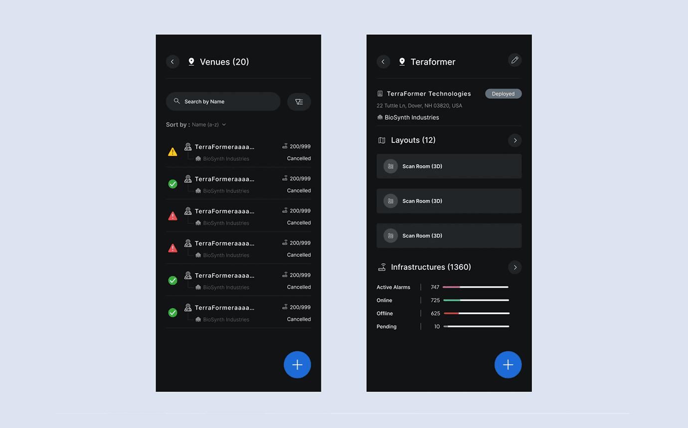
For order bumps, the challenge was finding a pattern that could carry the product, offer copy, price and acceptance control without taking attention away from checkout. I explored compact inline treatments, card-led patterns and a more prominent call-to-action, each with a clear acceptance state.
The work kept the offer connected to the purchase rather than treating it as an isolated revenue widget.
Do not hide what blocks launch
A disabled button is rarely enough explanation.
Merchants could be blocked by payment setup, inactive funnel steps, missing tracking, license restrictions or an experiment that was not ready.
The interface needed to say what was wrong, why it mattered and where to fix it.
Launch was the start of another workflow
After launch, the merchant's question changed from “Is everything ready?” to “Where is this funnel losing customers?”
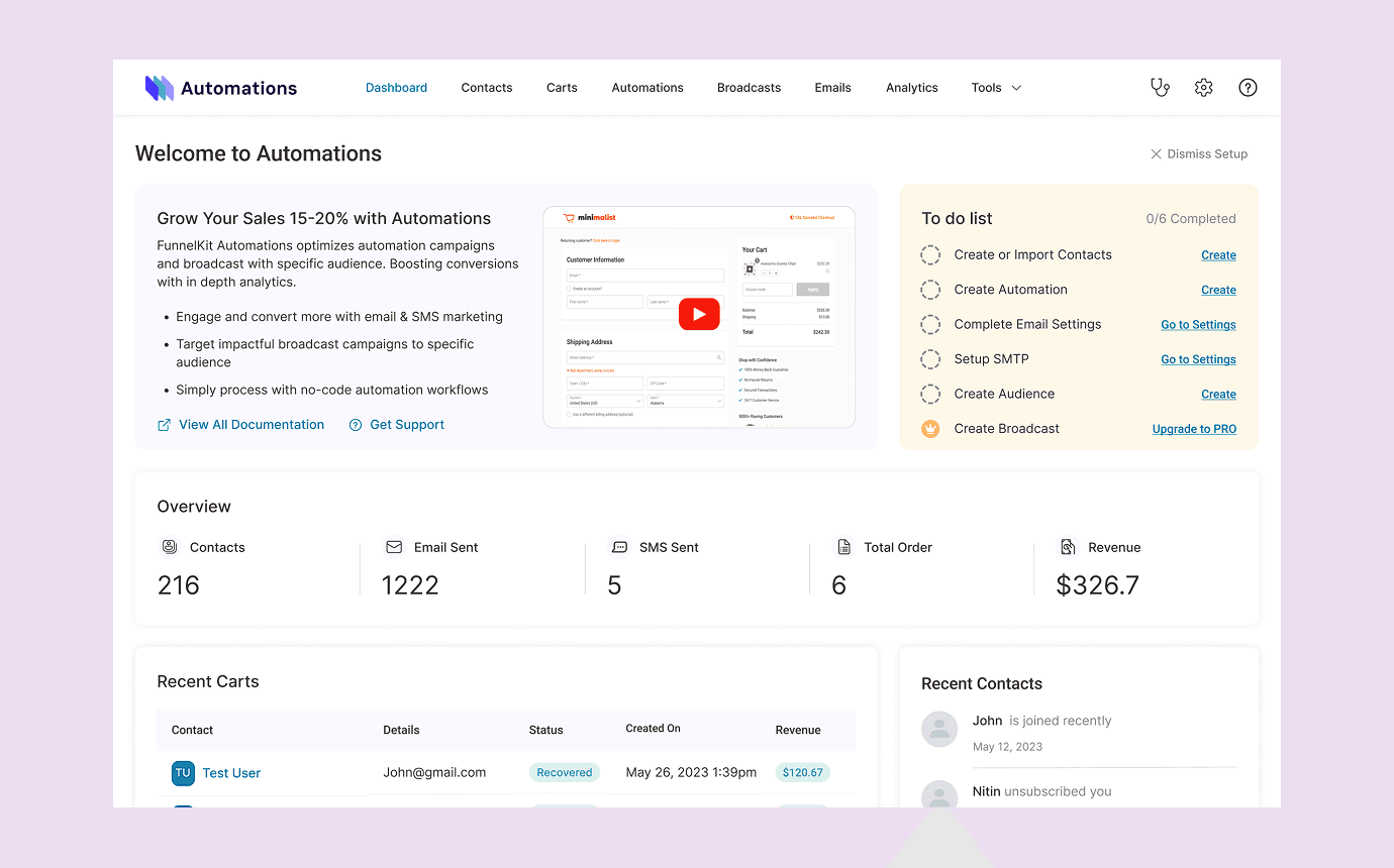
Analytics connected visits, orders, total revenue, order-bump revenue and upsell revenue to the funnel steps that produced them.
The checkout breakdown helped merchants locate drop-off. Date filters and comparisons let merchants choose the reporting window, compare it with a previous period or year, and see the effect across visits, contacts, orders, revenue and time to convert. FunnelKit's public documentation describes these measures and comparison tools. Read the analytics documentation.
Testing needed guardrails
Starting a test was only one part of the experience.
Merchants also needed to understand whether variants were valid, how traffic was divided, why a test could not begin and what happened after choosing a winner.
The readiness step checked those conditions before traffic was affected. FunnelKit's documentation confirms that merchants can test opt-in pages, checkout, order bumps and one-click upsells. Read the A/B testing documentation.
What I contributed
I worked on these flows as part of the FunnelKit product team:
- First-funnel onboarding
- Checkout and funnel-step setup
- Order-bump and upsell configuration
- Rule creation and conditional states
- Lite, PRO, upgrade and license states
- Analytics and A/B-testing workflows
- Mobile and responsive behavior
The wider team included product, engineering, support, growth and other design contributors. This was a shared platform, not the work of one person.
Results, separated by source
Public product scale
- More than 30,000 active WordPress installations
- 5 out of 5 stars on the WordPress plugin listing
Source: WordPress.org plugin directory.
Directional product analytics
The retained project notes record average order value moving from $67 to $78 after the cart experience shipped. They also record cart abandonment moving from 70% to 61%.
The notes do not retain the store mix, cohort or measurement window. I treat these as directional signals, not controlled causal results.
Usability testing
Across 50 participants in two rounds, the final post-purchase treatment reached 94% visibility. “Complete Your Order” reached 31% acceptance in the final test, compared with 24% for “You Might Also Like” and 18% for “Don't Miss This Deal.” These are usability-test results, not production conversion rates.
What I would improve next
The product still has room to make the funnel easier to understand as it grows.
I would focus next on:
- Showing dependencies directly on the funnel canvas
- Explaining why a recommended next step matters
- Making experiment status easier to scan
- Keeping Lite and PRO limits clear before setup begins
- Connecting analytics insights to suggested actions without pretending the product already knows the answer