Design systems machines can actually read.
Internal design-to-code validation score from 35% to 80% across three AI tools.
- Role
- Product Designer
- Team
- Sole Designer
- Timeline
- 3 Months
- Type
- Self-initiated
At a glance
14 min read
- Problem
- AI tools like Figma MCP could convert designs to React code, but the output looked nothing like the actual design system: hardcoded colors, wrong spacing and generic components instead of the real ones.
- Insight
- AI doesn't see your Figma file the way a developer does. It needs structured tokens, named variables, and a machine-readable JSON mapping to produce accurate output.
- Result
- An 80% internal validation score for Figma-to-React conversion and a design system that gives humans and machines the same token and component contract.
80%
Internal validation score
320
Variables across 3 tiers
156
Tokenised components
“Every design system speaks two languages: one for humans, one for machines. I built the bridge between them and lifted the project's internal design-to-code validation score from 35% to 80%.
Imagine handing a new developer your Figma file and asking for a button. They come back with the right shape, roughly the right padding, and a blue that exists nowhere in your brand. Not a wrong answer exactly. Just not your answer.
That is what every AI tool did with my design system. It was reading pixels when it needed to be reading tokens.
The Gap Nobody Was Talking About
Three AI tools, one Figma file, three variations on the same failure: output that looked almost right and bypassed the token system entirely.
Every design team I'd worked with had the same problem, stated differently. Engineers would open a Figma file, see a beautiful component library, and then rebuild it from scratch using hardcoded values. The design system existed in Figma. It existed in code. They were never the same thing.
Then AI entered the picture. Figma MCP, Cursor and Clore could all read a Figma file and generate React components. The promise was thrilling. The reality was not.
I ran the same test across three AI tools. I gave each one a Figma file with a fully built design system, with components, variants and auto-layout. The output:
- Colors: AI picked the nearest hex value instead of using the actual design token.
#1A73E8became#1976D2. Close enough for a human eye. Wrong enough to break a theme. - Spacing: Padding was 23px instead of the 24px defined in our 4px base grid. Margins were arbitrary. The spatial rhythm was gone.
- Components: AI created new components from scratch instead of referencing the existing ones. A button was built from divs and spans instead of using the
Buttoncomponent from the library. - Typography: Font sizes were pixel values instead of token references. Line heights were computed, not semantic.
The output looked almost right. But "almost right" in a design system is broken. Tokens exist so that one change propagates everywhere. If AI bypasses the token system, the entire point of the design system collapses.
"The AI generated a button that looked perfect. Then we changed our primary color in the design system, and the AI-generated button didn't update. It was a fossil, a snapshot of a system it never actually used."
Reframing the Problem
Two weeks of debugging before the actual diagnosis: the tools were fine. The design system was built for eyes, not for parsers.
I spent two weeks debugging AI output before I realised I was solving the wrong problem. The issue wasn't the AI tools. The issue was that my design system was designed for human eyes, not machine parsing.
Humans can look at a Figma file and intuitively understand that a blue button uses the primary brand color. AI reads the file as a data structure. If the data structure says fill: #1A73E8, that's what it uses, regardless of whether a variable called Color/Brand/Primary exists in the file.
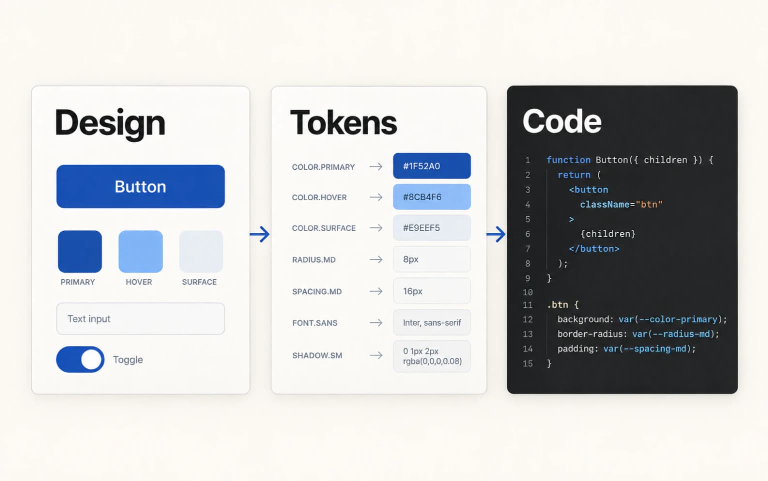
The realisation was simple but fundamental: AI needs the same kind of structured, named, machine-readable system that APIs provide for code. Design tokens aren't just a consistency tool for humans. They're an interface for machines.
I reframed the work: I wasn't building a design system. I was building an API that happened to be expressed in Figma.
The Process: Five Phases
Audit what exists, restructure into three token tiers, rename for machine parsing, export a JSON bridge, then validate against the tools that consume it.
Phase 1: Audit what exists
Before changing anything, I mapped every component, every style, every value across the existing design system. The audit revealed three categories:
| Category | Count | AI-friendly? |
|---|---|---|
| Components with proper variants | 12 | Partially. Variants existed but weren't named for machine parsing |
| Hardcoded style values | 847 | No. Colors, spacing and typography are all inline |
| Components without variants | 38 | No. Single-state, no structured data |
847 hardcoded values. Each one a potential point of failure when AI tries to convert the design.
Phase 2: Build the variable architecture
Figma's variable system is the foundation. I restructured the entire design system around three tiers:
Tier 1, Primitive tokens (Global): The raw values. Color primitives, spacing numbers, font sizes. These never get used directly in components.
Show all 12 primitive tokens
| Token | Value |
|---|---|
Color/Blue/50 | #E3F2FD |
Color/Blue/100 | #BBDEFB |
Color/Blue/500 | #1A73E8 |
Color/Blue/900 | #0D47A1 |
Spacing/0 | 0px |
Spacing/1 | 4px |
Spacing/2 | 8px |
Spacing/3 | 12px |
Spacing/4 | 16px |
Spacing/6 | 24px |
Spacing/8 | 32px |
Spacing/12 | 48px |
Tier 2, Semantic tokens: Purpose-driven names that map to primitives. This is where AI gets its context.
Show all 13 semantic tokens
| Token | Maps to |
|---|---|
Color/Brand/Primary | → Color/Blue/500 |
Color/Brand/Primary/Hover | → Color/Blue/600 |
Color/Brand/Primary/Active | → Color/Blue/700 |
Color/Text/Primary | → Color/Gray/900 |
Color/Text/Secondary | → Color/Gray/600 |
Color/Text/Disabled | → Color/Gray/400 |
Color/Surface/Base | → Color/White |
Color/Surface/Raised | → Color/Gray/50 |
Color/Surface/Overlay | → Color/Black/20 |
Spacing/Button/Horizontal | → Spacing/4 |
Spacing/Button/Vertical | → Spacing/2 |
Spacing/Card/Padding | → Spacing/6 |
Spacing/Section/Gap | → Spacing/8 |
Tier 3, Component tokens: The most specific layer. These reference semantic tokens and map directly to component properties.
Show all 9 component tokens
| Token | Maps to |
|---|---|
Button/Primary/Background | → Color/Brand/Primary |
Button/Primary/Background/Hover | → Color/Brand/Primary/Hover |
Button/Primary/TextColor | → Color/White |
Button/Primary/Radius | → Radius/md |
Button/Primary/Height | → Size/10 |
Input/Border/Default | → Color/Gray/300 |
Input/Border/Focus | → Color/Brand/Primary |
Input/Background | → Color/Surface/Base |
Input/Height | → Size/10 |
Why three tiers, not two? Because AI needs the semantic layer to make decisions. If it only sees primitives, it picks the wrong blue for a text color. If it only sees component tokens, it can't adapt when the brand changes. The semantic layer gives AI the intent behind each value.
Phase 3: Name everything for machine consumption
This was the most time-consuming phase and the most important. I renamed every variable, every component, every property with a consistent, parseable naming convention.
The four naming rules, with before and after
- Slash-separated hierarchy:
Category/Context/State, which AI can parse as a path - No spaces, no special characters: Underscores for multi-word, no hyphens (inconsistent across tools)
- State as suffix:
Button/Primary/Hover, notHover/Button/Primary - Consistent vocabulary:
BackgroundnotBg,DisablednotInactive,DefaultnotNormal
| Before | After |
|---|---|
blue-500 | Color/Blue/500 |
button_blue | Button/Primary/Background |
hover state | Button/Primary/Background/Hover |
16px padding | Spacing/Button/Horizontal |
The naming convention isn't aesthetic. It's an interface contract. Every slash is a level of hierarchy that AI can navigate. Every consistent suffix tells AI what state it's looking at.
Phase 4: Create the JSON bridge
Figma variables live in Figma. React code lives in code. The JSON file is the translation layer.
I exported every variable collection from Figma and structured it as a hierarchical JSON file that maps directly to CSS custom properties and React component props.
Show the JSON structure
{
  "colors": {
    "brand": {
      "primary": {
        "value": "#1A73E8",
        "cssVar": "--color-brand-primary",
        "figmaVariable": "Color/Brand/Primary",
        "usedIn": ["Button/Primary", "Link/Default", "Checkbox/Checked"]
      },
      "primary-hover": {
        "value": "#1557B0",
        "cssVar": "--color-brand-primary-hover",
        "figmaVariable": "Color/Brand/Primary/Hover",
        "usedIn": ["Button/Primary/Hover"]
      }
    }
  },
  "spacing": {
    "button": {
      "horizontal": {
        "value": "16px",
        "cssVar": "--spacing-button-horizontal",
        "figmaVariable": "Spacing/Button/Horizontal"
      }
    }
  }
}
What makes this JSON different from a simple token export:
figmaVariable: the exact path in Figma, so AI can cross-referencecssVar: the generated CSS custom property nameusedIn: which components reference this token, so AI knows the contextvalue: the actual value, used as a fallback
This file is the single source of truth. Figma reads it. React reads it. AI reads it. When I update a token in Figma, I update it in the JSON, and the change propagates to both the design file and the codebase.
Phase 5: Validate with AI tools
I tested the new system across multiple AI tools and LLMs:
| Measure | Generic design system | AI-friendly design system |
|---|---|---|
| Figma MCP + Cursor | 35% | 78% |
| Figma MCP + Claude | 40% | 84% |
| Figma MCP + Clore | 30% | 78% |
| Average | 35% | 80% |
What "accuracy" means here: correct colors (actual token, not nearest hex), correct spacing (token-based, not arbitrary), correct component references (library component, not rebuilt), correct typography tokens (semantic sizes, not pixels), correct responsive behavior (breakpoint-aware).
What Changed in the AI Output
Same prompt, same file. The output stopped being a hand-built lookalike and became an import of the real component.
Before: AI guessed based on visual proximity
// AI-generated button (before)
<div style="background-color: #1976D2; padding: 10px 16px; border-radius: 4px;">
  <span style="color: white; font-size: 14px; font-weight: 500;">Click me</span>
</div>
Hardcoded values. Wrong blue. No component reference. No token system.
After: AI referenced the actual design system
// AI-generated button (after)
import { Button } from '@/components/ui/button';

<Button variant="primary" size="default">
  Click me
</Button>
Uses the real component. Tokens flow through the component's internal styling. One change to the token updates this everywhere.
The JSON made AI think in systems, not pixels
The breakthrough wasn't just better naming. It was that the JSON file gave AI a system to reference. Without it, AI looked at a blue rectangle and tried to reproduce the blue rectangle. With it, AI looked at Button/Primary and understood: this is a component, it has states, it uses these tokens, it appears in these contexts.
AI stopped being a pixel copier and started being a system participant.
Using It: The Loop I Run for Every Screen
Four steps, run for every screen. The system is only half of it; the other half is refusing to prompt as though the file does not exist.
Building the system was half the work. The other half was learning to drive it, because a machine-readable design system does nothing if you still prompt as though the file does not exist.
The failure I kept repeating early on was treating the AI like a search engine and the design system like a folder it would think to open. It does not. Unless the contract is in front of it, it will invent a perfectly reasonable blue.
So the loop starts by handing over the contract, and only then asking for anything.
The four steps
1. Load the contract first
tokens.json and the naming spec go into context before the request does. Not as reference material, as the rules of the room.
2. Name components, never describe them
"Button/Primary" resolves to a library entry. "a blue button" resolves to whatever the model saw most often in training.
3. Audit against the system, not the mockup
A screen can look right and still be built from hardcoded hexes. The audit asks a different question than the eye does.
4. Fix at the token layer
A wrong colour is rarely one wrong component. Correcting the token fixes every generation that follows it.
Step 1: Load the contract before the request
Every session opens with the same two artefacts: the JSON bridge from Phase 4 and the naming spec from Phase 3. In Claude Code that lives in a project rules file so it loads on its own. In Cursor it is a rules file. In a chat window it is a paste.
The wording that changed the output
The wording matters more than I expected. Attaching the token file and hoping is not the same as telling the tool the file is binding:
Resolve every colour, spacing and type value through tokens.json. If a value you need has no token, stop and tell me. Do not substitute the nearest hex.
That last sentence changed the output more than anything else in this project. Without it, a missing token produces a confident guess. With it, a missing token produces a question, and a question is a design system gap I can go and fill.
Step 2: Name components, never describe them
The naming convention from Phase 3 only pays off if the prompt uses it. Describing a component invites the model to reconstruct it. Naming one makes it look the component up.
Prompt comparison, and the prompt library that rotted
| Prompt | What comes back |
|---|---|
| "Build a pricing card with a blue CTA" | A plausible card. New hexes, new spacing, a button that resembles ours |
"Build a pricing card using Card/Elevated and Button/Primary, spacing from Spacing/Card/*" | The library components, with the tokens they already reference |
❌ What did not work. I tried keeping a prompt library of long, carefully worded requests. It rotted within weeks, because every token change made a dozen prompts subtly wrong. The prompts had become a second source of truth competing with the first one.
✅ What worked. Short prompts that name components and defer everything else to the JSON. The prompt stays stable because it holds no values. When the system changes, the prompt does not have to.
Step 3: Audit against the system, not the mockup
A generated screen can look correct and still be built entirely from hardcoded values. Comparing it to the mockup will not catch that, because it was drawn to match the mockup.
The five audit criteria
So the review is a separate pass with a different question, run against the same five criteria the validation in Phase 5 used:
- Does every colour resolve to a token, or is there a raw hex anywhere
- Is spacing token-based, or are there arbitrary pixel values
- Does it reference the real library component, or a rebuilt lookalike
- Is typography semantic, or hardcoded sizes
- Is responsive behaviour breakpoint-aware
I ask the tool to run this on its own output before I look at it. It finds most of its own hardcoded values when asked directly, which is a strange thing to type but has held up consistently.
Step 4: Fix at the token layer, not the component
When something comes back wrong, the instinct is to correct the component in front of you. That fixes one screen and leaves the cause in place.
Why token-layer fixes compound
Almost every wrong value traces back to a token that is missing, ambiguously named, or absent from usedIn. Fixing it there means the next generation inherits the correction, and the one after that. Fixing the component means doing it again next Tuesday.
This is the part of the loop that compounds. The system does not get better because the model improves. It gets better because every correction lands somewhere the model has to read.
What this changes for a team
The loop is not really about AI output. It is about where the truth lives.
Once the JSON is binding and the naming is parseable, a designer, an engineer and a model are all reading the same file. Disagreements stop being matters of taste and start being diffs. Someone joining the team learns the vocabulary from the tokens rather than from whoever is free that afternoon.
That was the unexpected result of building for machines. The constraint that made the system legible to AI is the same constraint that made it legible to people.
The Ripple Effects
Building for machines paid off for humans: onboarding by reading token names, and design review rounds down from 3-4 to 1-2.
Designers benefit too
The structured naming convention improved human work as well. New designers onboarding to the system could understand the token hierarchy by reading the names. Color/Text/Secondary tells you exactly what it's for and where it belongs. gray-600 doesn't.
Engineering handoff got faster
Engineers stopped asking "what color is this?" and "what spacing did you use?" The JSON file answered both questions. Pull requests that previously needed 3–4 rounds of design review dropped to 1–2.
The system compounds
Every new component I add follows the same token architecture. Every new token I add gets the JSON entry. The AI accuracy improves with each addition because the mapping gets richer.
After three months of internal project tracking:
- 156 components with proper variants and tokens
- 320 variables across all three tiers
- 80% average accuracy across AI tools
- 60% reduction in design-to-code iteration cycles, measured against the pre-rebuild workflow
What I'd Do Differently
Design the JSON contract first, name for machines before humans, and validate with AI at every phase instead of only at the end.
Review the four lessons
Start with the JSON, not end with it
I built the Figma variables first, then exported to JSON. If I'd designed the JSON schema first, thinking about what AI needs to see, the Figma variable structure would have been cleaner from the start. The JSON is the contract. Design the contract first.
Name for AI before naming for humans
I initially named variables the way I thought designers would expect: Primary Blue, Small Padding, Body Text. Then I renamed for machine parsing: Color/Brand/Primary, Spacing/Button/Horizontal, Font/Size/Base. The machine-friendly names turned out to be more readable for humans too. Hierarchy via slashes beats naming via adjectives.
Validate with AI tools at every phase, not just the end
I built the entire variable system before testing with AI. Several naming patterns that seemed logical to me were confusing to AI. A naming convention is only as good as the tools that consume it. Test early, test often.
Document the naming convention as a living spec, not a README
The naming rules live in a document that AI reads before generating code. This document is the most important artifact in the system, more important than the tokens themselves. A naming convention without documentation is just vibes.
What This Means for Design Systems
Design systems were built for two audiences. There is a third now, and it reads your file as a data structure.
Design systems were built for two audiences: designers and developers. There's a third audience now, and it's growing fast: AI tools that read, interpret, and generate from your design files.
If your design system is optimised only for human eyes, AI will bypass it. It'll pick the wrong tokens, rebuild your components, and produce output that looks right but breaks the moment you update a value.
The design systems that will thrive in an AI-native workflow are the ones that treat their token structure as an API: well-documented, consistently named, machine-readable, and validated against the tools that consume it.
I built that system. The 80% accuracy number isn't the end. It's the baseline. Every token I add, every component I structure, every naming convention I enforce pushes that number higher. The design system isn't just a source of truth for the team anymore. It's a source of truth for the machines that build with the team.
"The best design system is one that both humans and AI can use without asking questions. I built the version that makes that possible."
80%
Internal validation score
320
Variables across 3 tiers
156
Tokenised components
60%
Fewer iteration cycles