Same offer, same price, right moment.
Acceptance from 18% to 31% by asking three seconds later.
- Role
- Product Designer
- Team
- Team of 6
- Timeline
- 7 Months
- Type
- Full-time
At a glance
8 min read
- Problem
- WooCommerce stores showed static thank-you pages while customers had payment saved and intent still active.
- Insight
- Upsell acceptance is a timing and framing problem, not a product or pricing one. 3-second delay + “Complete Your Order” framing = 31% acceptance.
- Result
- 31% acceptance in final usability testing, 15-20% typical AOV lift in production, 4-minute setup vs 45+ minutes for competitors.
30,000+
Active installs (suite, WordPress.org)
31%
Peak acceptance in 50-user testing
15–20%
Typical AOV lift in production
“Same customer. Same offer. Same design. Acceptance swung from 18% to 31% based on one variable: when we asked. The problem was never what to offer. It was when.
Imagine you have just paid. Your card details are still on screen, the order is going through, and you are waiting for the one thing you actually want: confirmation that it worked.
Instead a full-screen offer drops in front of you. Eight of the ten people I tested that on used the same word, pushy, and six were hunting for the skip button before they had read a single line.
The Decision I'm Most Proud Of
Legal review cost four points of acceptance. We kept the disclosure: 27% with full transparency beats 31% with a trust risk.
We built a one-click upsell system that hit 31% acceptance. Then legal review required explicit charge disclosure before any one-click purchase.
Initial button: "Add to Order" Required: "Add to Order, $29.99" with microcopy "Your saved payment method will be charged."
Acceptance rate dropped 4% (31% to 27%). We kept the disclosure.
27% with full transparency is better than 31% with a legal and trust risk. These are customers' credit cards. They deserve to know what they're agreeing to before they tap. A designer who optimises conversion at the expense of user trust isn't doing their job. They're doing the job wrong.
Senior designers hold positions that aren't always the most commercially expedient. This was one of those moments.
Here's how we got there.
The Opportunity Nobody Was Taking
In the WooCommerce store sample reviewed, 94% showed a static thank-you page. Nobody had combined one-click purchase, real targeting and sub-5-minute setup.
The 30 seconds after a customer completes a purchase are unlike any other moment in e-commerce. Payment is saved. Intent is high. Positive commitment mode. The reference ranges used in the project put post-purchase upsell acceptance at 10-20%, several times higher than cold traffic conversion (1-3%) or promotional email conversion (1-2%).
In the WooCommerce store sample reviewed for this project, 94% were showing customers nothing but a static thank-you page. The original sample size was not retained in this portfolio record, so this describes the audited sample rather than the whole WooCommerce market.
The market had three options, all flawed.
- Plugin A: Required customers to re-enter payment info, conversion dropped to ~8%, defeating the purpose
- Plugin B: Genuinely one-click, but showed random offers with zero targeting logic
- Plugin C: Smart targeting, but 45-minute setup, most merchants never activated it
Nobody had combined true one-click purchase + relevant targeting + sub-5-minute setup. That was the gap.
The Central Hypothesis
Acceptance is a timing and framing problem, not a product or pricing one. Both halves were tested before any design work began.
Post-purchase upsell acceptance is not primarily a product or pricing problem. It is a timing and framing problem.
I built this hypothesis before any design work began, then structured the entire project around testing it.
The timing test: I showed 30 shoppers the same upsell offer, identical product, price, and design, at different points after a completed purchase. Participants were recruited via UserTesting (screener: purchased online in the last 7 days).
| When shown | Acceptance rate | What customers said |
|---|---|---|
| 0–30 seconds | 18% | "I just spent $80. Now you want more? I'm done." |
| 3 seconds | 31% | "Oh, this would actually go perfectly with what I bought." |
| 5+ seconds | 19% | "I'd already moved on mentally." |
Same customer. Same offer. Same design. The difference was entirely when.
The framing test: During beta, I ran framing tests with 50 participants across two rounds of 25 to validate before committing to the copy direction.
| Framing | Acceptance |
|---|---|
| "Complete Your Order" | 31% |
| "You Might Also Like" | 24% |
| "Don't Miss This Deal" | 18% |
13 percentage points from word choice alone. Copy is not decoration in behavioural design. It is the mechanism.
What Existing Products Got Wrong
500 Hotjar sessions and 30 interviews with customers who declined: predatory framing, irrelevance, and payment friction.
Reviewing 500 post-purchase sessions on Hotjar and interviewing 30 customers who declined upsell offers, the failures had three consistent causes.
Predatory framing destroyed trust. Competitor upsells appeared immediately after payment on full-screen blocking pages: "WAIT! EXCLUSIVE OFFER, LAST CHANCE BEFORE IT EXPIRES!"
"This feels like a bait-and-switch. I just paid. Now they're trapping me with another offer."
Irrelevance made offers invisible. Most plugins showed bestsellers regardless of what was in the cart. A yoga mat buyer seeing a jump rope isn't a recommendation. It's noise that signals "we don't know anything about you."
Friction collapsed conversion. One-click: 10-20% acceptance. Re-entry of payment required: 3-6%. Same product, same timing, 3-4x difference. Any friction at this moment breaks the psychological window.
Best-in-class examples told the opposite story. Amazon's "Frequently bought together" uses co-purchase data and informational framing. Dollar Shave Club's "Complete your kit" positions additions as finishing something. Both feel like help, not sales. That distinction drove every design decision.
Testing the Hypothesis
Fullscreen read as pushy. Embedded went invisible. A sequential reveal at 3 seconds hit 31% acceptance and 94% visibility.
Test 1: Fullscreen takeover
After checkout: full-screen offer page. Clear hierarchy. Prominent CTA.
10 customers. 8 of 10: "pushy." 6 of 10 were scanning for a skip button before reading the offer.
❌ Killed it. 8 of 10 read it as pushy before reading the offer.
Finding: fullscreen pages trigger a defence response. Anything blocking order confirmation reads as threatening, not helpful. The timing hypothesis was right, but this delivery method activated the wrong psychological state regardless of timing.
Test 2: Embedded in the thank-you page
Offer below order confirmation. Non-blocking. No interruption.
Better reception, but 5 of 8 missed the offer entirely.
❌ Killed it. Non-intrusive turned out to mean invisible: 5 of 8 missed it entirely.
Finding: prominence competes with confirmation. Subtle enough not to compete = invisible. I needed something that waited for the right moment rather than existing statically on the page.
Test 3: Sequential reveal at 3 seconds
The thank-you page loads normally. Order fully confirmed. After 3 seconds, when the timing data showed customers shift from closing to validation mode, a card slides in from the right edge:
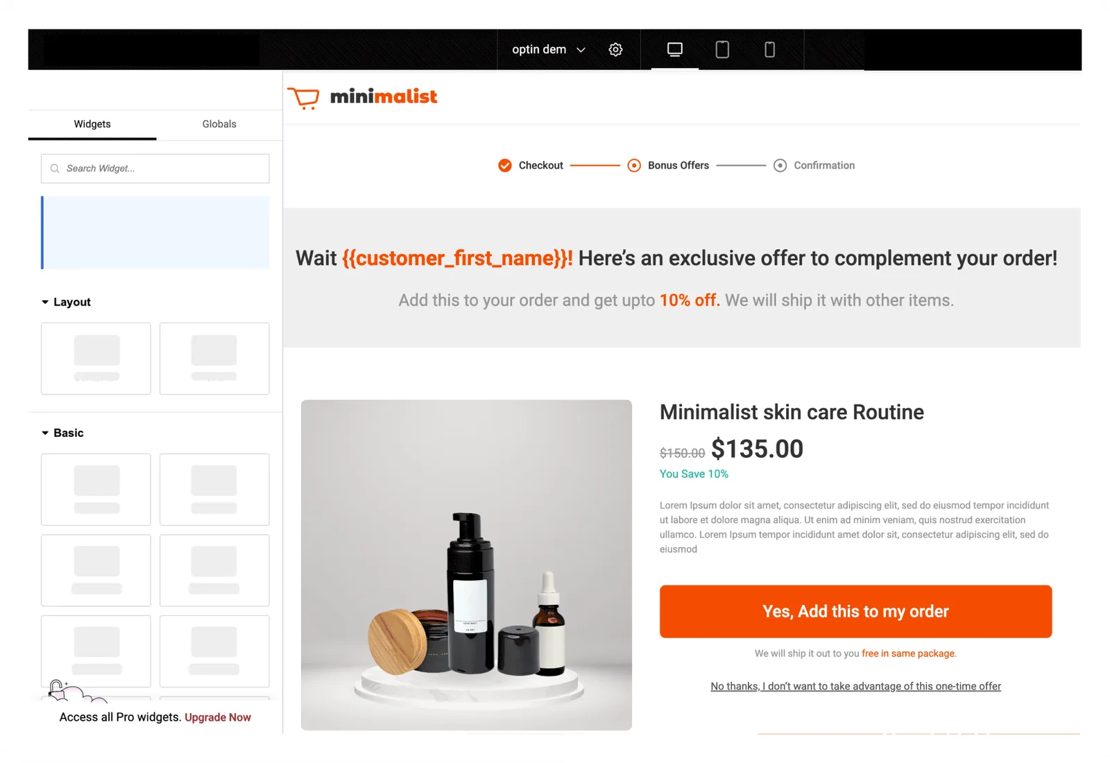
"Complete Your Order" "Customers who bought [product] also loved:" [Product image, Title, Price] [Add to Order, $29.99] / [No thanks]
Why slide-in from the right: Matches notification behaviour users already know. Non-blocking. Spatially dismissible. Consistent with the Sliding Cart's drawer pattern, customers in the FunnelKit ecosystem already had this mental model.
✅ Shipped it. 50-user test of the final design: 31% acceptance, 94% offer visibility.
Design Principles That Guided Every Decision
Well-timed, honest, easy to decline, familiar — with five targeting rules hidden behind a five-question setup form.
04. Design principles
Not just "show an offer"
Make it well-timed. Make it honest. Make it easy to decline.
Well-timed
Wait for the order to land before asking for anything else.
Honest
Real price, real product, no invented scarcity.
Easy to decline
Declining takes one tap and never hides the confirmation.
Familiar
Behaves like a notification people already know how to dismiss.
Relevance over volume. Five targeting rules, derived from co-purchase pattern analysis cross-referenced with a merchant survey: genuine strategies already in use, not designer assumptions:
The five targeting rules and where they came from
- Product-specific (yoga mat to yoga blocks): Most common pattern in both data and merchant behaviour
- Category-based (coffee to brewing equipment): Merchants called these "natural product families"
- Cart value targeting (orders over $100 to premium upgrade): Higher-value orders showed different co-purchase patterns in the data
- Customer history (first purchase vs. repeat): Repeat customers bought differently, less price-sensitive, more likely to try new product lines
- Bundle pricing (complete the kit, save 15%): Merchants using manual bundles consistently reported higher post-purchase satisfaction
Merchants configure this through a five-question setup form. The conditional logic underneath is complex. That's the point.
One downsell maximum, tested, not assumed. When a customer declines, one lower-priced alternative appears. Beta data: 18% of declines accepted the downsell. I tested two downsells in sequence with a 20-user subset. At the second offer: 94% "No thanks" rate, and 7 of 20 expressed annoyance unprompted. "Now I feel like I'm being nagged." The trust cost exceeded the revenue value. Maximum one downsell is a rule grounded in testing, not instinct.
Iterative beta loop. 200 merchants over 8 weeks. Each wave of feedback produced a direct design response.
What each wave of beta feedback changed
- Weeks 1-2: "I don't know which products to offer" to pre-configured offer templates
- Weeks 3-4: "I want to test offers" to built-in A/B testing with auto-winner declaration
- Weeks 5-6: "Mobile offers feel cramped" to redesigned for 85% screen width, larger touch targets
Merchant Results
Production settles below lab numbers, as it always does. 15–20% AOV lift at a 16% acceptance rate.
Production acceptance settled below the lab result. At the observed 16% production rate, an illustrative store with 500 monthly orders would see: 80 acceptances × $14.50 average = $1,160/month, or $13,920/year. This is a scenario calculation, not a promised store outcome.
Customer Behaviour Data
Five production A/B tests across thousands of orders. Every relative pattern from the lab held at scale.
| Measure | Winning variant | Alternative |
|---|---|---|
| Complementary vs. similar products | 19% | 12% |
| Bundled vs. individual items | 21% | 16% |
| Discounted vs. full-price | 18% | 14% |
| Image offers vs. text-only | 17% | 10% |
| 3-second delay vs. immediate | 18% | 13% |
Production rates run below the 50-user lab numbers, as they always do, but the relative pattern held at scale across thousands of real-world tests: timing and framing decide outcomes, not product or price.
Where I Was Wrong
International merchants were invisible to me, scheduling was core rather than edge, and I measured conversion instead of trust.
Read the post-launch lessons
International merchants were invisible to me. 23% of installations came from outside US/UK/Australia. USD hardcoded in templates. "Complete Your Order" translates awkwardly in several languages. Two tiers of experience: the merchants I'd imagined, and everyone else.
Time-based scheduling was core, not edge case. 34% of post-launch merchants requested seasonal offer scheduling. Promotions are how merchants think about their business. I'd categorised something central as niche. (Shipped post-launch.)
I measured conversion, not long-term trust. V2 hypothesis: 4+ upsell acceptances per customer may correlate with measurable churn. If the data confirms it, the design response is a per-customer frequency cap: protect the merchant's brand relationship, not just their short-term revenue.
30,000+
Active installs (suite, WordPress.org)
31%
Peak acceptance in 50-user testing
15–20%
Typical AOV lift in production
4 min
Setup time (vs. 45+ competitors)
4.9 / 5
Rating, 1,000+ reviews